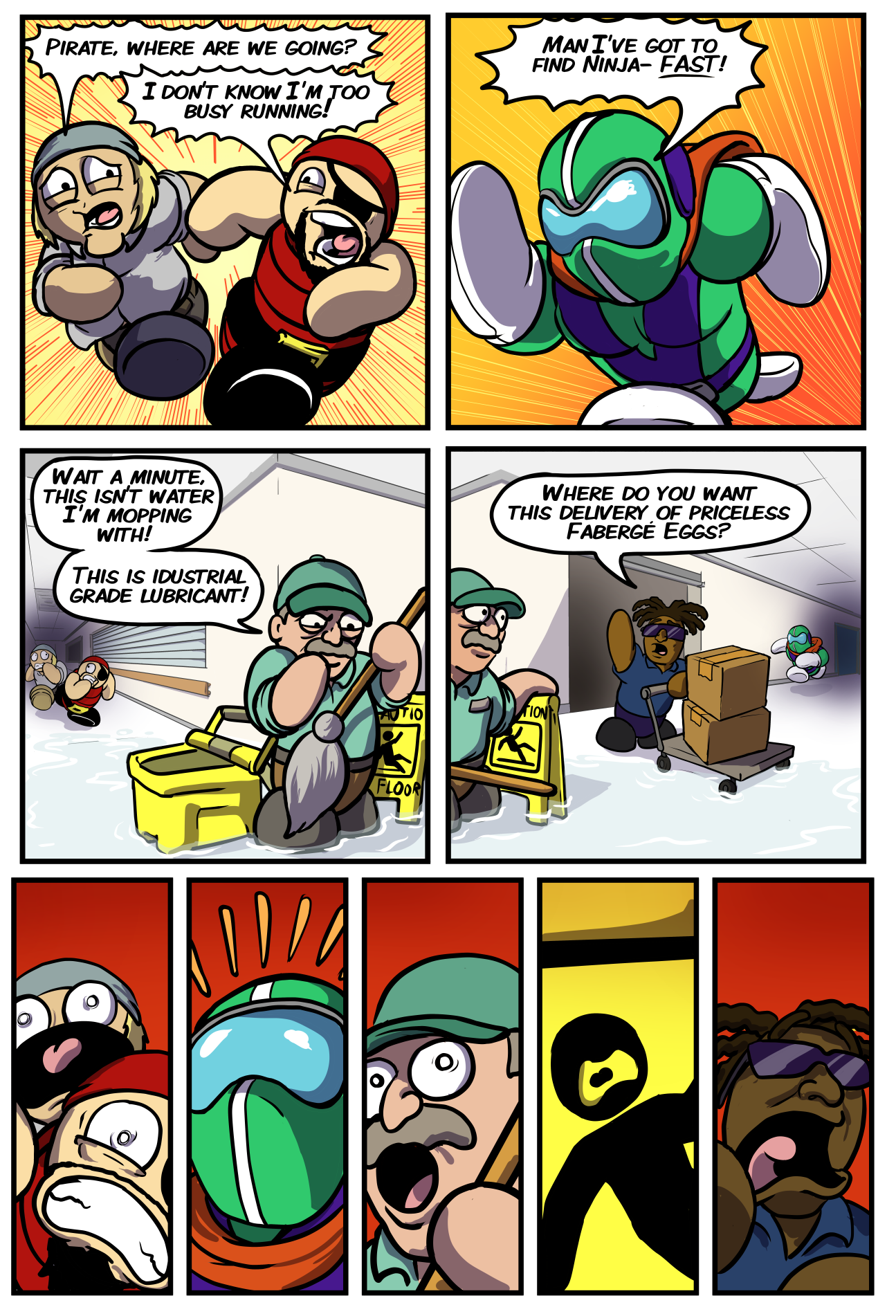
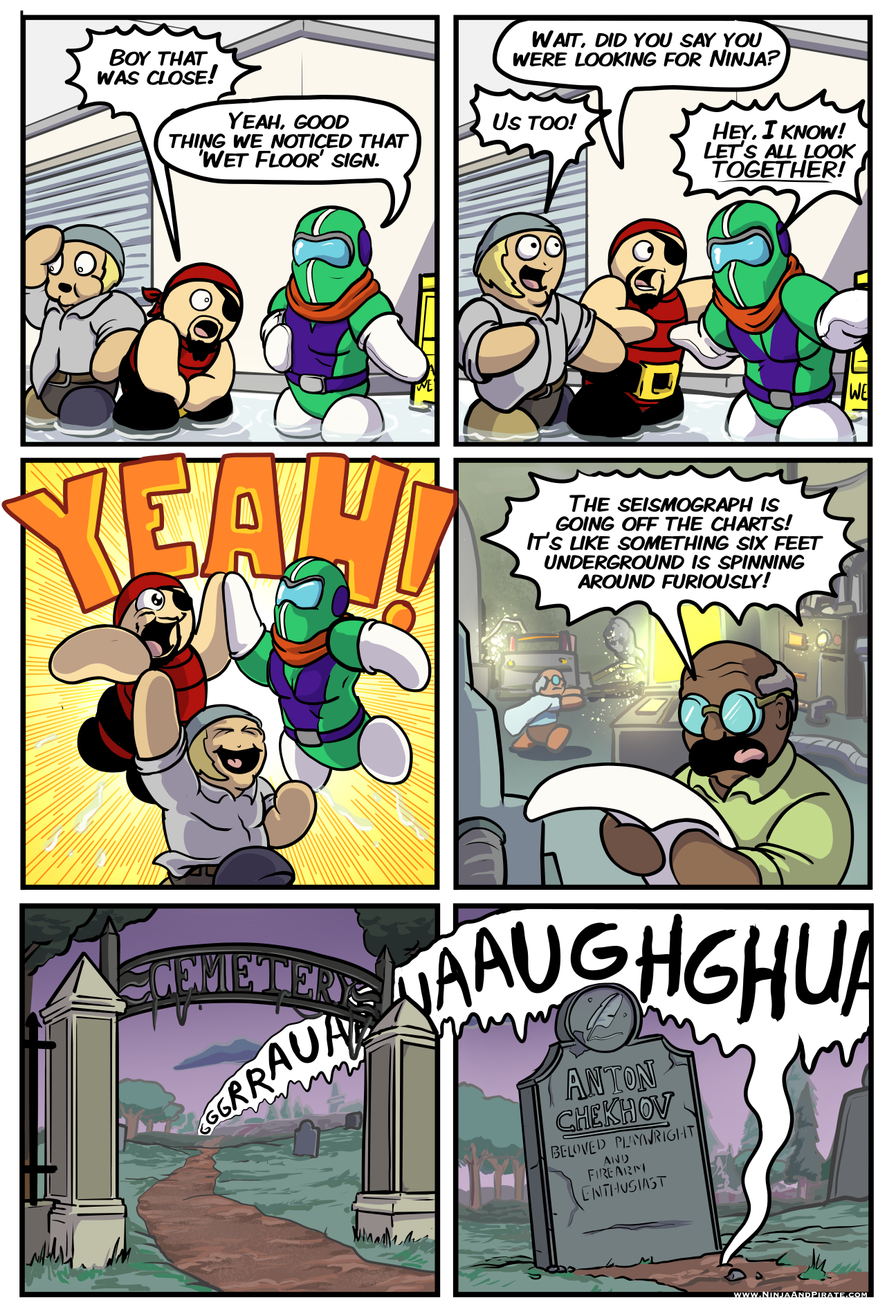
Here’s a double pager to make up for my sick leave a few weeks ago!
So I’m not totally sold on the timing of these pages but there’s a lot of stuff artistically I did that I’m very pleased with. The lubricant I think came out well. I love the second panel camera position and the warping of Ty’s form in it- it looks like a fisheye lens or something and I think it reads super well. I like the dialogue bubble going across the panels in the payoff panels, but mostly I like how it goes behind the pillars to come to the forefront. Most of all I think the atmospheric perspective on the final two panels reads pretty decently. I’m pleased with how that came out as atmospheric perspective is absolutely a colossal problem I face as an artist. So lots of little things add up to make me pretty pleased with how this one came out. Now let’s watch it absolutely bomb, eh?


Discussion ¬