I try to do something different with every Ninja and Pirate comic and this one is one of the few I didn’t really try to do something new or that I hadn’t before. I’m trying to get my foreground characters to pop more against the background to the eye has less trouble telling on what to focus. So for this comic I did what I tried to do last comic but from the start- I made the background purposefully muted in both color holds and line art. Hopefully it works. Maybe it doesn’t. But I think it creates a fair marquee of the foreground but I could just be looking at it too long.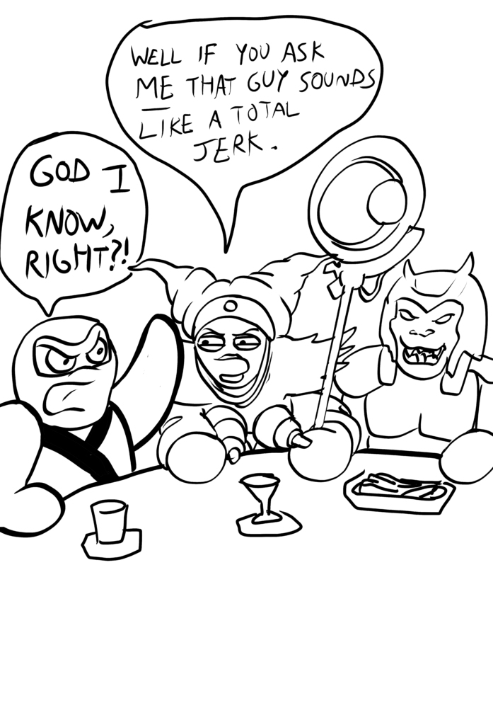
Ninja and Pirate
The adventures of Ninja and Pirate: An all-ages webcomic published every Wednesday and Saturday!

Ninja and Pirate: Volume 1 On Sale Now!
Chapter Jump, Yo!


Discussion ¬